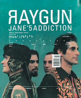
Ray Gun was an alternative magazine that started in the 90's. The issues featured a range of different artists and bands like Iggy Pop, Teenage Fanclub, Rage Against the Machine and Bjork. It used type-style graphics and had a recognisable, abstract sometimes unreadable appearance. I really like the artistic style of this magazine's covers, I like the how the words and artists' names are mixed up and layered into the photos. I want my magazine to have a unique, artistic look.
I love Banksy and I think street/ urban art would link well into my magazine and attract attention as it would stand out from other covers.
Banksy is instantly recognisable, he has a distinctive style - he uses a lot of stencil work for his pieces which allows him to create detailed art quickly. He often uses a freehand style for words which gives it a more personal feel to the message. He uses popular, well known images and phrases in his work to draw people's attention but changes them to give a certain message or idea. For example this piece, uses the well-known phrase from Marie Antoinette who said "Let them eat cake" to the French public during a famine. As cake was a luxury food that only the rich could afford it made her seem insensitive and ignorance of the peasants way of life. Banksy uses this to represent the current financial and the idea that bankers (and people in charge) aren't interested in the welfare of the people. The way the rat is clutching to the briefcase of money and looking over its shoulder suggests that he is doing something he shouldn't - stealing the money/ being greedy. He uses "crack" instead of "cake" to make it more relevant to modern day and to show that they don't care if people become drug addicts.
 Here Banksy uses the well-known image on from the front of The Clash's London Calling album. He changed the picture to show the man throwing an office chair rather than a guitar. I think this is to make it more general and show frustration and rebellion on a working man's level.
This is another style of street art, it is more cartoon like and brighter. This is by a group of street artist called ABOVE, their work is easily recognisable by the arrows. I think Banksy's black and white stencil style looks more artistic and I would like to incorporate it into my magazine.


No comments:
Post a Comment