Wednesday 29 December 2010

Street art linked to music.

Different styles of art is used a lot by bands to represent their genre of music and make them stand out.
For example, Blur got Banksy to design the cover of their album, Think Tank.


The style of the dripping paint and the black & white stencil graffiti style imagery made me think of Green Day's album artwork for 21st Century Breakdown and Shenanigans.
I love how the words are layered into the picture and how the red lines give the idea of the American flag.


In their music video for 21st Century Breakdown they use a street art style with the brick walls in the background and the black & white stencil style images.


In 2009, before the release of 21st Century Breakdown, they commissioned a group of artist to do an exhibition inspired by the songs from their new album. These are some the pieces that were produced.


I think the street art style artwork works very well for Green Day because it represents the rebelliousness of their lyrics and music genre. It also gives a sense of mystery and secrecy to the band, if someone hasn't seen or heard of them before, when they pick up their album they don't see the faces of the bands or artist who made it which makes it more interesting and eye-catching. Rather than having a dull posed picture of the band the artwork gives people an idea what the album and music is all about. It will either appeal to someone and encourage them to buy the album or it won't.

Other album covers with urban /street art style, these bands have very different music genres but I like how they have used a style that represents the music on their album. For example, Snow Patrol use a couple walking together in snow gear, their music is mainly about love and relationships and the outfits have connotations with the bands name.


Audience Profile.

Name: Katie Riley

Age: 16

Gender: Female

Currently doing A-Levels at Lutterworth College. She spends a lot of her spare time listening to music. She likes  wide range of genres including rock, indie, punk, alternative. She is a fan of music from past generations such as The Jam, Sex Pistols, The Who and Joy Division, she has inherited her music taste from her Dad who has a large record collection and introduced her to music from his youth. She loves seeing bands live at gigs and festivals, and has been going to Glastonbury yearly with her family since a young age.

Likes:
Other than music her interests include:
  • Horse riding
  • Shopping
  • Art
  • Watching films - Tim Burton is one of her favourite directors
  • Socializing with family and friends
  • Indie/ British inspired fashion - she is a huge fan of Jack Wills
  • Reading magazines - she buys NME regularly
Dislikes:

  • Pop groups
  • Eating meat
  • Queen 
  • Muse

Friday 24 December 2010

Research into Ideas.

  Further ideas for magazine.


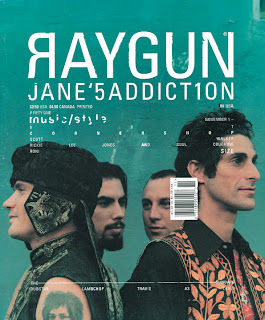
Ray Gun was an alternative magazine that started in the 90's. The issues featured a range of different artists and bands like Iggy Pop, Teenage Fanclub, Rage Against the Machine and Bjork. It used type-style graphics and had a recognisable, abstract sometimes unreadable appearance. I really like the artistic style of this magazine's covers, I like the how the words and artists' names are mixed up and layered into the photos. I want my magazine to have a unique, artistic look. 


I love Banksy and I think street/ urban art would link well into my magazine and attract attention as it would stand out from other covers.
 

Banksy is instantly recognisable, he has a distinctive style - he uses a lot of stencil work for his pieces which allows him to create detailed art quickly. He often uses a freehand style for words which gives it a more personal feel to the message. He uses popular, well known images and phrases in his work to draw people's attention but changes them to give a certain message or idea. For example this piece, uses the well-known phrase from Marie Antoinette who said "Let them eat cake" to the French public during a famine. As cake was a luxury food that only the rich could afford it made her seem insensitive and ignorance of the peasants way of life. Banksy uses this to represent the current financial and the idea that bankers (and people in charge) aren't interested in the welfare of the people. The way the rat is clutching to the briefcase of money and looking over its shoulder suggests that he is doing something he shouldn't - stealing the money/ being greedy. He uses "crack" instead of "cake" to make it more relevant to modern day and to show that they don't care if people become drug addicts.

Here Banksy uses the well-known image on from the front of The Clash's London Calling album. He changed the picture to show the man throwing an office chair rather than a guitar. I think this is to make it more general and show frustration and rebellion on a working man's level.


 This is another style of street art, it is more cartoon like and brighter. This is by a group of street artist called ABOVE, their work is easily recognisable by the arrows.


I think Banksy's black and white stencil style looks more artistic and I would like to incorporate it into my magazine.  

Monday 13 December 2010

Preliminary work on magazine.

This is the front cover and contents page that I created:

The design changed slightly for the front cover. For the background my first thoughts were to have a plain white background however it looked too bare and empty so I decided to add the textured look background. I replaced red with purple because when I did it the red looked to harsh and distracted the eye from the text and image. I also changed some of the text to make it more to the point and appealing. I made the "Get Your Design Out There" lettering embossed because it seemed to disappear into the image with out the white outline.

For the contents page I changed the layout completely because when I did it I didn't like the look of the images in a line because they just seemed to be hovering and it didn't look very effective. I also wanted to cut up the text so it wasn't one list and to show the different sections of the issue. I also decided not to use some pictures because it looked better with two larger images rather than four smaller ones.

I'm pleased with the outcome however I think I could have made it look more interesting by using a wider variety of fonts and text colour on the front cover. Also I think the contents page could look better if it had a different background and style to the front cover because I don't think the background works as well for the contents as it does for the cover. I found this preliminary work very useful because I got to practise using PhotoShop and understand more about what has to be involved in creating an effective front cover that will attract the right people.

Preliminary work on magazine, pre-production.

For the preliminary work, I had to create a new college related magazine with a mid close-up shot, text and a masthead.

These are the draft drawings of my magazine cover and contents page:

I decided to create a magazine for the Textiles department, I called it Mercado because she used to be the head of the department which I thought made it more relevant to Lutterworth College specifically.

I had to think about a colour theme that would stand out but have an aesthetic balance so the colours do not clash which would be uncomfortable for people to look. I decided to use black, white and red because it would stand out and the colours are classed as unisex so the magazine could appeal to boys and girls. I decided to get my friend, Lydia to pose for the front cover because she is fashionable and stands out from a crowd, also her t-shirt linked to the colour scheme and would make her stand out from a coloured background.

Although I did not decide on an actual font but during planning I had to think about what would stand out and still be readable. I decided that some important text and puffs should be bold and italic and other less important features should be normal. I had to think about what articles would be included in the issue that would be appealing to the reader and relate to the subject.

Thursday 9 December 2010

Magazine Brief.

For my AS Media Coursework I have to create a front cover, a contents page and a double page spread article for a new music magazine. I have to record all research and planning that will help me produce a final magazine that will appeal to my target market and analyse existing magazines to discover what makes a magazine successful.