These are the photos that I will use in the ripped collage for the background of the cover and double page spread. I think I will make them black and white so the only colour in the background is the blue and red of the sections of the Union flag.
Monday, 14 February 2011
Photographs for magazine.
These are possible shots for the front cover:
These are possible shots for the contents page:
These are possible shots for the double page spread:
Saturday, 12 February 2011
Contents page mock-ups.
I think the use of editing in the background as well as the photos is a bit too much and distracts too much from the text which should be the main focus of the page.
The photos on this mock-up need to be larger and split up the text more because the list format is a bit boring to read and doesn't specify the different sections of the magazine.
Friday, 11 February 2011
Practising with the camera.
I practised using the different settings on my camera to get the right type of photo for my photoshoot.
Thursday, 10 February 2011
Front cover photo edits.
I think the last edit works the best because the first one defines the edges too much and the second looks too washed out.
Cover mock-ups.
I think the collage style background is too organised and repetitive in this one but I like how you can see the background through their legs which looks better than the other one were there is no gaps.
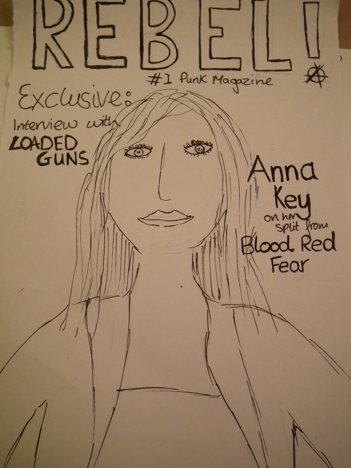
I have found that with the group of three people on the cover it is hard to add other information with out covering someone's face so I think I'm going to use a photograph of just the lead singer on the cover.
I have tried using the brush tool in photoshop to create a painted effect but it doesn't look very professional so I think I am going to use the layered collage style for the background instead.
Subscribe to:
Posts (Atom)